By Tojo15 min read
You need to show a client or customer exactly how a peak lapel jacket looks in a specific fabric, color, or pattern, but a photo shoot isn't in the budget or the timeline. A standard peak lapel jacket mockup template solves that problem by giving you a photorealistic render you can customize in Photoshop rather than on a set.
So what exactly is this template? It's a layered PSD file built around a jacket with the classic upward-pointing peak lapel, the collar style you see on double-breasted suits, tuxedos, and sharper single-breasted blazers. A narrow peak lapel jacket mockup PSD is simply a variation with a slimmer lapel width, useful when you're presenting a more modern or fitted silhouette rather than a traditional wide-lapel cut. Both work with smart objects, so your design drops in and automatically follows the fabric's folds and shadows.
In this article, we'll break down what makes a peak lapel mockup different from other jacket styles, what's inside a well-built PSD file, and how to tell a good template from one that will fight you every time you try to change the fabric or lapel color.
Why designers use peak lapel jacket mockups
Formal apparel sells on structure, and the peak lapel is the clearest visual cue for that structure. Suits, tuxedos, and sharp blazers all lean on the upward point of the lapel to signal tailoring, so when you're pitching a client on a new jacket line, a men's peak lapel jacket PSD mockup shows the collar exactly the way a buyer expects to see it on a rack or a lookbook page. Skip that detail and use a notch lapel mockup instead, and the whole presentation reads as slightly off, even to someone who couldn't tell you why.
Cutting photography costs and turnaround time
Budget is usually the first reason designers switch to mockups. A single photo shoot for a jacket line, tailored samples, a model, a studio, a photographer, and retouching can run past a thousand dollars before you've even tested a second colorway. A PSD mockup replaces that entire process with a file you already own. You place your pattern, export a flat render, and move on to the next fabric option in the same afternoon.
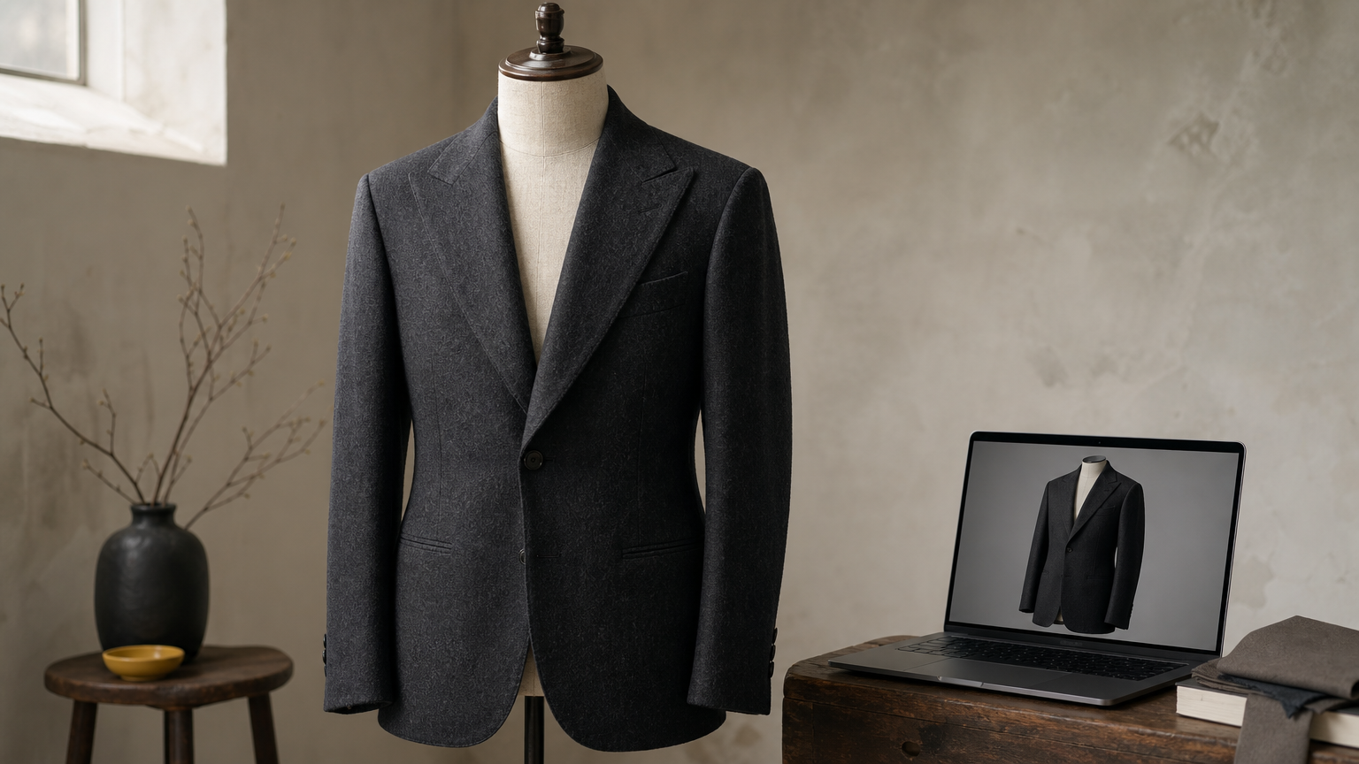
A mockup turns a week of photography into an afternoon of Photoshop.
Here's a rough comparison of what each route actually costs you in time and money for a small apparel line testing three jacket colorways:
| Task | Traditional photo shoot | Mockup template |
|---|---|---|
| Sample garments needed | 3 physical jackets | 0 |
| Studio and photographer | $600-$1,200 | $0 |
| Turnaround per colorway | 2-4 days | 10-20 minutes |
| Revisions after client feedback | New shoot or reshoot fee | Re-export the layer |
| Total for 3 colorways | $1,800-$3,600+ | One template purchase |
Once you see those numbers side by side, the appeal of a downloadable photo-realistic jacket mockup PSD stops being about convenience and starts being about margin.
Selling variations before you commit to production
Beyond cost, mockups let you test ideas that would be reckless to produce physically. Say you're deciding between a charcoal wool and a midnight blue with a subtle windowpane check for a groomsmen line, built on a double-breasted peak-lapel tuxedo mockup. Cutting and sewing three sample jackets to compare them is slow and expensive. Dropping three fabric swatches into the same peak lapel jacket mockup and rendering them side by side takes minutes, and you get to see all three under identical lighting, which is the only fair way to compare fabrics anyway.
Many designers use this same file to run client approvals before a single yard of fabric gets cut. You send over two or three renders, the client points to the one they like, and you've locked in a decision with zero material waste. That's a workflow print-on-demand sellers and small tailoring brands both lean on heavily, since neither can absorb the cost of a wrong guess at scale.
Building a consistent brand catalog
Lighting consistency matters more than most designers expect until they've tried to shoot a full catalog themselves. Every photo session introduces small variables, a shadow that falls differently, a slightly different camera angle, a model who stands with a different posture from one session to the next. None of that shows up as a huge problem in isolation, but stack twenty product photos next to each other on a category page, and the inconsistency becomes obvious.
Relying on the same base render for every product solves this automatically. A narrow-peak lapel jacket mockup PSD used across your entire fitted-blazer line, for instance, gives you identical lighting, draping, and camera angle on every listing. Buyers scanning your catalog register that polish even if they can't name what's causing it, and it reads as a brand that has its production process under control.
Designers who work across formalwear collections, suits, tuxedos, vests, and jacket linings get an added benefit: mockups make it painless to keep a whole range visually aligned. If you want to see how a full formalwear catalog can share one consistent render style, our library of bespoke jacket and suit mockup PSDs at ShirtsMockup is built around exactly that use case, with the same layered structure across styles, so nothing looks like it came from a different photographer.
How to customize a standard peak lapel jacket mockup PSD
Opening a well-built standard peak lapel jacket mockup template for the first time can feel overwhelming if you've never worked with layered PSD files before, but the process follows the same handful of steps no matter which jacket style you're editing. You're mainly working with smart objects, adjustment layers, and a folder structure that separates the jacket body from the lining, buttons, and stitching. Once you understand that structure, customizing a new colorway takes minutes instead of hours.
Getting oriented inside the layer panel
Before you touch anything, open the layers panel and scroll through the folder groups, the same first move covered in our walkthrough on editing a PSD mockup file in Photoshop. Most templates group elements logically: jacket shell, lapel, lining, background, and shadow layers, so you're not hunting through fifty ungrouped layers trying to guess what controls the sleeve. Spend two minutes clicking the visibility toggle on each group to see what it affects. This single habit saves you from accidentally editing the wrong layer and wondering why your fabric change isn't showing up on the render.
Placing your design through the smart object
Here's the actual workflow you'll repeat for every colorway or pattern:
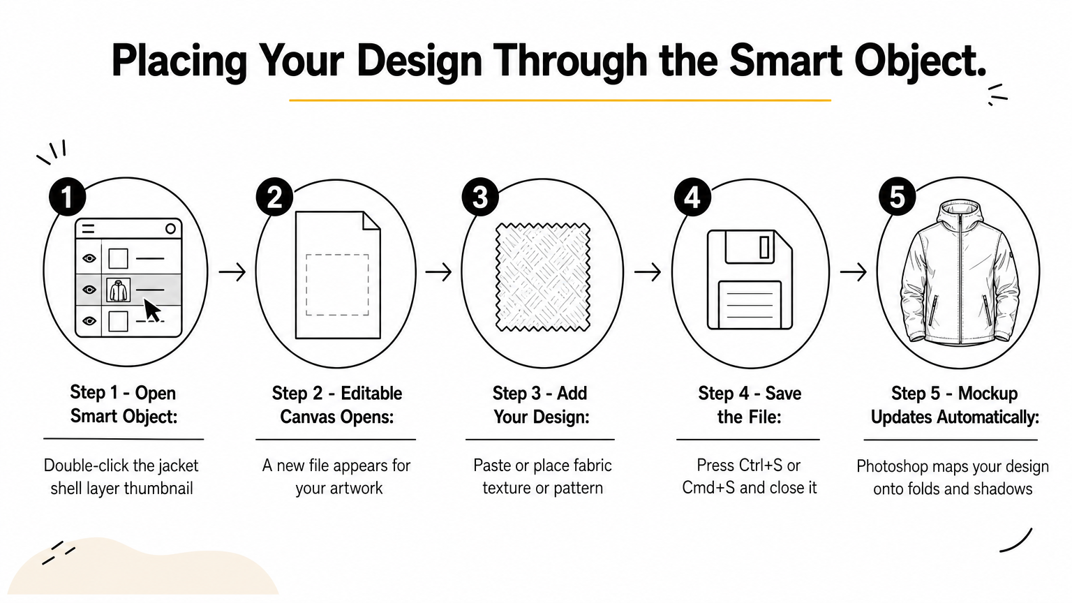
- Double-click the smart object thumbnail for the jacket shell layer.
- A new file opens; this is your editable canvas.
- Paste or place your fabric texture, pattern, or flat color fill.
- Save that file (Ctrl+S or Cmd+S) and close it.
- Photoshop automatically updates the main mockup, mapping your design onto the folds and shadows.
The smart object does the hard work; you just drop in the design and save.
Quick edits like this are exactly why smart layers for applying fabric textures have become standard in mockup files. You never touch perspective, shadow, or fold detail directly; the file handles that math for you.
Adjusting color and lapel detail separately
Jackets with a peak lapel often include a separate smart object just for the lapel color, which matters if you're presenting a jacket with contrast satin lapels, common on tuxedos, or a self-fabric lapel more typical of business suits. Adjusting this independently from the jacket body lets you test a black satin peak lapel against a self-fabric version without rebuilding the whole render. Some templates also include a lining smart object visible through the jacket opening, worth filling in if your presentation shows the jacket slightly open or worn on a model, and a dedicated custom jacket lining PSD mockup handles that detail on its own.
Fine-tuning with adjustment layers
Lastly, most professional templates include adjustment layers above the smart objects for tweaking brightness, contrast, or hue without ever touching the base texture. Nudging these lets you match a fabric swatch's actual tone more precisely than the smart object placement alone usually achieves, since scanned or photographed fabric swatches rarely come in perfectly color-balanced. Save your final export as a flattened JPEG or PNG for client presentations, but keep the layered PSD intact so you can revisit the same file for the next colorway request without having to start over.
Standard vs narrow peak lapel: choosing the right mockup
Width is the entire difference between these two lapel styles, and it changes how a jacket reads to a buyer before they even notice the fabric. A standard peak lapel jacket mockup template shows a wider lapel that extends further toward the shoulder seam, the look you associate with classic tailoring, peak lapel suit styles and fit, and traditional tuxedos. A narrow-peak lapel jacket mockup PSD trim that same lapel down, giving you a slimmer, more modern silhouette that suits fitted blazers and contemporary suiting lines. Neither is objectively better. The right choice depends entirely on the garment you're actually selling.
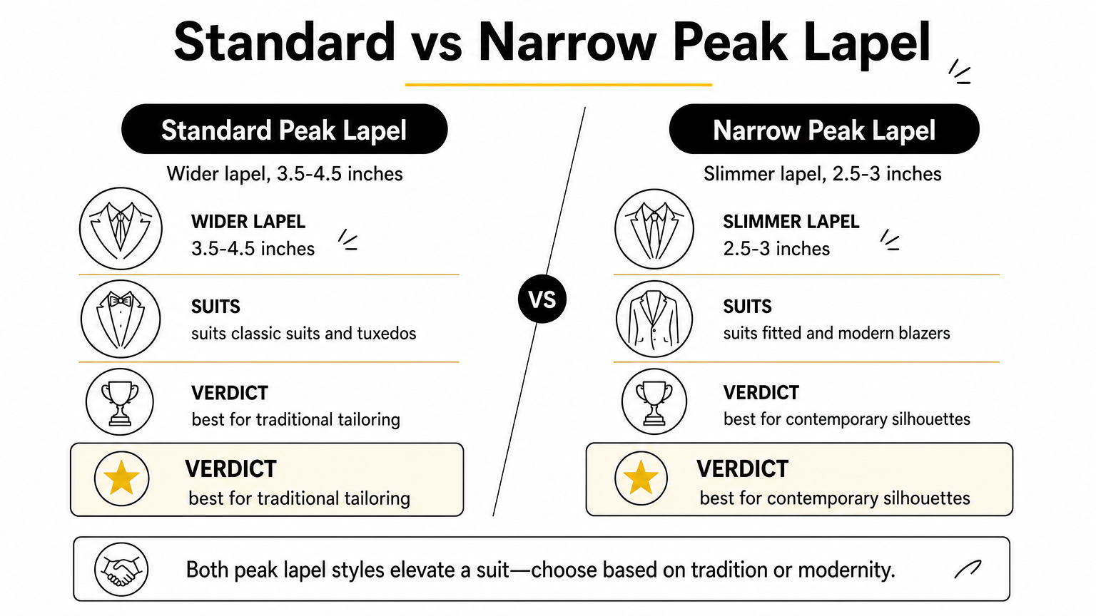
Pick the lapel width that matches your garment's real cut, not the one that photographs slightly better.
Matching the lapel width to your actual garment
Getting this wrong is more common than you'd think, especially when a designer buys a mockup template based on the render looking sharp rather than checking the actual lapel measurement against their pattern. If your jacket pattern has a lapel that breaks roughly 3.5 to 4 inches wide at the widest point, a standard peak lapel template will represent it accurately. Fitted or slim-cut jackets typically run closer to 2.5 to 3 inches, which is where the narrow version earns its keep. Presenting a slim-cut blazer inside a wide-lapel mockup makes the garment look bulkier and more formal than it is, and customers who receive the physical product will notice the mismatch immediately.
Here's a quick reference for matching the mockup to the garment:
| Garment type | Typical lapel width | Better mockup match |
|---|---|---|
| Classic suit, double-breasted | 3.5-4.5 inches | Standard peak lapel |
| Traditional tuxedo | 3.5-4 inches | Standard peak lapel |
| Slim-fit business suit | 2.5-3 inches | Narrow peak lapel |
| Fitted modern blazer | 2.5-3 inches | Narrow peak lapel |
| Fashion-forward tailoring | 2-2.5 inches | Narrow peak lapel |
Why the mismatch matters more than it seems
Since most buyers can't articulate lapel width in inches, they judge it by feel instead, whether a jacket looks sharp and current or heavy and dated. Using the wrong lapel width in your mockup skews that first impression before a single review comes in, and returns tied to fit complaints often trace back to product photos that oversold the garment's proportions. Testing both versions against your actual sample, if you have one, is the fastest way to confirm you picked correctly. Lay your physical lapel against the rendered one at the same scale and check whether the point falls in a similar spot relative to the shoulder seam.
Thinking through your full product line helps, too. If you sell both classic and slim-fit jackets, keep a standard peak lapel template and a narrow one on hand, rather than forcing a single style to represent both cuts. It costs you one extra file and saves you from misrepresenting half your catalog.
Features that separate a professional mockup from a basic one
Not every file labeled a standard peak lapel jacket mockup template delivers the same quality. Plenty of cheap downloads look fine in the thumbnail preview and fall apart the moment you drop in a real fabric pattern. The difference usually comes down to a handful of technical details buried in the PSD structure, details that are invisible until you're actually working the file at 2 a.m., trying to hit a client deadline.
Smart object depth and fabric mapping
Grasping this distinction starts with how the smart object handles perspective. A professional file wraps your design around the jacket's actual curvature, so a plaid or windowpane pattern bends correctly across the chest, sleeve, and lapel fold instead of sitting flat like a sticker. Cheaper templates often use a single flat smart object with no perspective warp built in, which means stripes that should angle slightly at the shoulder seam instead run perfectly straight, an error most buyers notice even without knowing why the image looks wrong.
A pattern that doesn't bend with the fabric is the fastest way to spot a low-quality mockup.
Shadow, fold, and highlight separation
Building on that, realistic shadow layers are what make a rendered jacket look like it's actually made of cloth rather than painted on. Look for templates that separate highlights, mid-tones, and cast shadows into their own blend-mode layers above the smart object. This setup lets your fabric color show through the folds naturally, since the shadow data sits on top rather than getting baked into a single flattened texture. Basic templates skip this step entirely, so any color you place looks uniformly flat with no depth at the seams or lapel roll.
File organization and export resolution
Organization matters just as much as rendering quality, especially once you're managing multiple colorways across a product line. Here's what to check before you commit to a template:
| Feature | Basic mockup | Professional mockup |
|---|---|---|
| Layer naming | Generic (Layer 1, Layer 2) | Labeled by part (Lapel, Lining, Shell) |
| Resolution | Under 2000px wide | 3000-4000px wide, print-ready |
| Smart object count | One flat object | Separate objects for the shell, lapel, and lining |
| Background | Fixed, non-editable | Adjustable or swappable |
| Color mode | RGB only | CMYK-convertible for print |
Spotting a poorly labeled layer panel before you buy saves you the frustration of guessing which of thirty unnamed groups controls the collar.
Consistent lighting across a template family
Finally, check whether the mockup belongs to a matched set. A well-built, narrow-peak lapel jacket mockup PSD should use the same lighting rig, camera angle, and background as its standard-width counterpart, so you can swap between them without your catalog suddenly looking like two different photo shoots. Our high-resolution blazer mockup collection is built this way on purpose, so switching lapel widths mid-project never breaks the visual consistency you've worked to establish across a formalwear line.
Common mistakes that ruin a realistic mockup result
Even a well-built standard peak lapel jacket mockup template falls apart in the hands of someone rushing the export. Most mistakes that keep realistic PSD mockups from looking realistic have nothing to do with the file quality and everything to do with workflow shortcuts, skipping a step because a deadline is close, or because the render looked fine at thumbnail size. Catching these before you send a file to a client saves you the awkward follow-up email asking for a redo.
Placing flat art without checking the smart object warp
Dropping a pattern straight into the smart object and exporting immediately is the single most common error. Skipping the preview step means you never notice that your plaid or striped pattern sits flat across a curved chest panel instead of following the fold. Always zoom into the lapel roll and sleeve seam before exporting; if the pattern lines look perfectly straight where the fabric should be bending, the smart object isn't mapping correctly, and the render will look pasted-on rather than photographed.
A pattern that ignores the jacket's curves gives away the mockup instantly, no matter how good the base render is.
Mismatching resolution between your design and the template
Building a mockup from a low-resolution logo or fabric scan is a fast way to blur an otherwise sharp render. If your PSD file renders at 3500 pixels wide but your fabric swatch is a 300-pixel phone photo, the final export will show visible pixelation the moment someone zooms in on a product listing. Match your source art resolution to the template's canvas size before you place anything, not after.
Forgetting the lapel color and lining layers
Overlooking the separate lapel color smart object is an easy miss, especially on a tuxedo mockup where contrast satin lapels are part of the design. Leaving that layer on its default fabric while changing only the jacket shell produces a render that contradicts your own product description. The same goes for the lining layer visible through an open jacket front; an empty or default lining reads as unfinished even if the rest of the render is polished.
A quick pre-export checklist
Running through a short list before every export catches most of these issues:
- Zoom into the lapel and sleeve to confirm the pattern bends correctly
- Confirm your source fabric or logo resolution matches the template's canvas size
- Check that the lapel color and lining smart objects reflect your actual design, not the placeholder
- Compare your export against the previous colorway for consistent brightness and shadow depth
- Flatten and save a copy, but keep the layered PSD untouched for future edits
Working through this list takes under a minute and prevents the small errors that can make an otherwise strong jacket mockup template look unfinished.
Putting your jacket design on display
A good peak lapel mockup is the fastest way to show a fabric, color, or pattern as a buyer will actually see it on a rack. You've now got the full picture: what makes this collar style different, how to work the smart objects without fighting the file, when standard width beats narrow, and which small mistakes turn a sharp render into an obvious fake. None of it requires a photographer or a sample garment, just a well-built PSD file and a few minutes of layer work.
If you're ready to stop guessing at fabric choices and start showing clients exactly what they're getting, grab the peak lapel jacket mockup PSD with smart layer and drop your first design in today. You'll have a client-ready render before your coffee gets cold.
Comments
No comments yet. Start the conversation.